March 19, 2024
The Beautiful, but Doomed, Olivetti Graphika
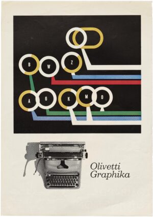
Much as I love Olivetti typewriters, I only recently learned about the company’s Graphika manual, first made in 1957 and produced for just under three years. While other Olivetti models made after World War II came in a variety of colours, the Graphika was only marketed with this glossy green finish. It was loosely based on Olivetti’s Lexikon 80 model from 1950 and designed by Marcello Nizzoli. The first Graphika typeface was a modernist beauty created by Hungarian-Swiss graphic designer Imre Reiner and called The Reiner. The second, equally elegant, typeface, created in 1958 by graphic designer A.M. Cassandre (aka Adolphe Jean-Marie Mouron), was called The Cassandre.
What’s a product without advertising? Olivetti hired a noted graphic designer named Giovanni Pintori, who had already created several posters for other Olivetti models, to execute one.
But, alas, the Graphika was only around for so short a time because it was a commercial failure. Why? Because it was engineered with proportional spacing. Manual typewriter fonts were usually “fixed pitch,” which means that each character, whether it’s an ‘i’ or ‘m’, takes up the same amount of space. So, for example, a fixed-pitch (also called monospaced) font, such as Courier, works well with the simple, mechanical design of a typewriter. Commercially-printed text and modern digital type used on computers is designed to be proportionally spaced. In this case, each letter is given just the amount of space it needs to be legible. With proportional spacing, you can fit more text on a page and improve readability.
Proportional spacing wasn’t entirely new. Since the late 19th century, most typewriters had been fixed-width but in 1944, IBM introduced The Executive with proportional spacing. Still, progress rarely happens immediately and it would take other manufacturers longer to adapt. So, what happened with the Graphika was a cautionary tale.
Why? For one thing, the machine required three levers to operate the spacing mechanism. Why? Okay, I’d better let the knowledgeable folks at the excellent typewriter site, The Antikey Chop, explain: “Well, the carriage advanced in .80mm increments and, depending on the width of the character, the carriage would advance 2, 3, 4, or 5 increments. For example, a period (.) advanced by 2 increments while an uppercase M advances by 5 increments. The problem was that, when backspacing to make corrections, the user had to manually do so in increments equal to the letter they typed. Confused? … exactly!”
Research found on The Antikey Chop, The Typewriter Database, The Classic Typewriter Page, The Typewriter Revolution.
March 13, 2024
Writing That Gets NoticedMarch 5, 2024
Thinking about NotebooksJanuary 27, 2024
R.I.P. Jon Franklin